|
JUXTAPOZ Issue #43, March 2003 The Peter Max Factor: an Artistic Constant in the Cosmic Equation
From Juxtapoz Magazine #43, March 2003 An Account of
the Art of Peter Max,
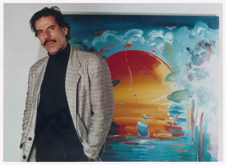
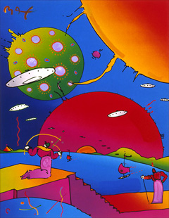
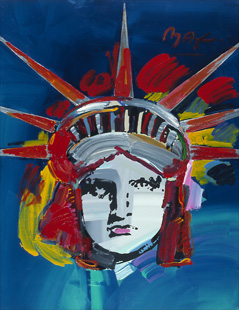
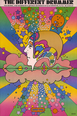
Peter Max is perhaps the most successful artist of all time. Billions see his work, whether they know it or not. He makes astronomical sums of money, and hob-nobs with the high and mighty. His ubiquitous style runs the gamut from countercultural craziness to patriotic proselytizing, his work just as at-home in the hallowed halls of the corporate world as on the yellowed walls of crash pads. As a symbolic entity — for all practical purposes America’s (Pop) Artist Laureate — he suffers the arrows of derision as well as the mob’s approving cheers, not unlike a politician or a pro athlete. Max’s famous formulation: vivid color, sparse, fluid lines, and optimistic subject matter. The artist himself appears as a character out of his own paintings, complete with aural glow and 60s moustache, bringing a message of peace to a troubled world. Art know-it-alls often neglect him or take him for granted. Some even dismiss him as proprietor of a stylistic sweatshop that churns out the same one or two pictures over and over again, milking a revered genre for all it’s worth while shamelessly hustling the ruling class. Whatever. Peter Max changed the way the world looks at art and for that alone he deserves to indulge himself in a non-stop carnival of color and cash. In fact, he persists as a significant talent, displaying an unparalleled mastery of the chromatic sciences. His trip began at the dawn of psychedelia, and continues into the distant future. Along the way, his spaceships and star-skippers interact with prehistoric archetypes in colors once known only to acidheads and art directors. He says, “I was going to become an astronomer. I drew stars, galaxies, celestial bodies, and spaceships mingled in with all these things I got from Eastern culture — and it developed into a style.” That style encompasses distinct categories: the early tripped-out art, done in the chroma of lysergic landscapes and solarized photos; the later neo-Fauvism, drenched in the brilliant colors of cosmetics and toys; the timeless Pop Art, colorizing America’s movie stars, big shots, presidents, and even the Statue of Liberty. After all, isn’t patriotic art, with its political superheroes and bigger-than-life icons, the logical extension of Pop? His studio, nestled within the media mecca of New York’s Upper West Side, explodes with colorful Mickey Mouses and Mick Jaggers, artifacts of Americana, beautifully tended plants, trappings of financial success, and an assemblage of attractive assistants proudly populating Planet Max. Peter was born in Berlin as the Nazis came to power; his family got out just in time, settling in Shanghai and prospering under the Japanese occupation of China. They split for Tibet in ’49, stayed there a few years before moving to Israel, then went to Paris, where Peter studied art. He came to the USA and hit the fabled advertising agencies of Madison Avenue where, he says, “Every hip art director started using me. I got a Society of Illustrators’ gold medal. I did portraits of Ornette Coleman, Yusef Lateef, Charlie Parker...” He went on to pioneer the poster as an expressive phenomenon. He rode acid rock’s shock wave, chronicling a confluence of hope and technology, reflecting the vibes of an awesome epoch and a nation’s culture. Peter’s very successful — a mixed blessing in the art world. His immersion in color started early: “The first color that ever stunned me was the orange-yellow of an egg yolk. Then I saw that same color on banners in Shanghai, against red. Then I saw the red against lavender, or against blue. That yellow is what opened up my door to color. I couldn’t see other colors until I saw them with the yellow. First it was the yellow with red, then the yellow with olive, then with pink, with brown, lavender — “Color was everywhere. Magicians and theatrical people wore very extreme colors — very rich in red. China has lots of red and gold. Fireworks, twirling things, smoke, incense — the colors and the extreme extravagance of showmanship had a huge impact on me.” Sometimes his underlying art-director persona percolates into conversation: “Great color combinations grab people.” But the fine artist quickly regains the high ground: “Of course you don’t use it to grab people; you use it because you love it,” he corrects himself. As for cosmic consciousness, he got a dose of spiritual energy in Tibet: “I saw all the Buddhist holy people. When I looked into their eyes, it was always tough, because you could never see the person themselves; all you saw was love. The deeper you looked, the more love you found, like a deep ocean of love. Eventually you had to blink and look away.” He recounts his early influences: “As a kid I gravitated towards American movies, comic books, jazz musicians — I was a huge collector of American icon culture. The Eastern civilization I grew up with was more of my inner life, inside the heart, inside the meditative mind. Me having come from the East to the West with mysticism, and always having been a student of multi-media — I found myself knowing both cultures very well. “Once I went to Madison Avenue and started dealing with creative directors and copywriters, I was amazed to learn that a single line could say something. Madison Avenue was a great education. I learned what the world was about.” Posters brought Peter to the people. The poster is a utilitarian transition between fine and commercial art, not considered permanent prior to the impact of Peter and a few West Coast artists. Max: “Posters had been around in different industries as advertising pieces. Lautrec made posters for the Moulin Rouge and Mucha did advertising posters for cigarette papers. Posters were mass media. “When I designed my first restaurant, Shelly Fireman’s Tin Lizzie, I said, ‘A restaurant is not a restaurant unless it has a poster!’ I went down to this printer and while I’m on the press mixing my colors — that’s how I did my color blends back then; it wasn’t airbrushed, the oscillating rollers blended the colors together — this fellow from the printing office said, ‘I’ve never seen anything like this before. An artist on top of the press, blending his own colors!’ I stepped down and he said, ‘My name is Shelly Stein.’ I said, ‘There’s a poster revolution coming our way and I would sure love to have a printer like you as a partner.’ He reached out his hand and said, ‘I’ll be your partner. How about fifty-fifty?’ I said, ‘Okay.’ We made posters but there were no poster shops — nobody had ever sold posters in quantity. Nowadays it’s common to roll them up, put a little number on top and put twenty-four in a box — we invented that. There was a young fellow named Michael Lang, who later on did Woodstock, who owned a headshop in Florida. He came up and said, ‘I heard you got some posters.’ I showed him posters for a buck each and he took six. He came back a week later and bought another twenty posters, and then a hundred and then five thousand. Then, a publisher out of France bought five thousand and two weeks later, twenty thousand. Two weeks later, they came and bought fifty thousand. In nine months, they sold seven million posters. It was unbelievable. Max posters were in every college dormitory — they were everywhere. I got calls like, ‘This is General Electric. Would you like to design a clock for us?’ Then Wrangler Jeans said, ‘Would you like to do denims for us?’ Suddenly, I had a company that produced images for 72 product lines. I was overwhelmed with success. In September 1969, I had an eight-page cover story in Life magazine. I ran my company with the help of about 55 beautiful young people and put a billion dollars worth of product on the marketplace. What was overwhelming was the amount of work. When you’re creating product lines, each line needs to be re-designed three or four times a year. I had 72 lines to do four times a year! I would draw day and night. And I had syndicated things all over the newspapers; I was in 186 newspapers on a daily basis. They told me I beat Dick Tracy.” Max’s East-meets-West synthesis ushered in new levels of enlightenment and, of course, new levels of exploitation. In the late 60s everything looked like Peter Max did it (wild colors, objects masquerading as inflated versions of themselves, cosmic dancers, rainbows, outer space motifs) — for example, Al Brodax’s animated Beatles film Yellow Submarine looked like Peter’s work but was actually done by Hans Edelman, hired after Peter declined the project. At his commercial zenith Max had posters everywhere, lotsa corporate licensing agreements, extensive newspaper syndication, TV exposure from a Datsun campaign, and big-time collectors. He’d decorated over a billion dollars worth of merchandise — and that’s in 1968 dollars! So of course he closed down his studio and walked away from it all. He wanted to do his own thing; as for his commercial commitments, he says, “I didn’t want them to take me on a trip.” He wanted to paint. “People say I disappeared in the 70s. Actually I just painted — I painted all the time and I really became good. “I’d done so much of that art with cosmic imagery that I, not because of any reaction out there, wanted to do something new. I wanted to be a painter, like Matisse, Picasso, and Vlaminck. I aspired to do something in a Fauvist-like genre. My previous style was so into the future that I needed to pull back into the past and ground myself. I gave up my company. I thought, ‘I’m going to retreat. I’m going to take four months off and just paint and draw.’ It was the greatest luxury I could have, to say ‘I am a painter and my place is to be in front of the canvas. My place is not mass production.’ That experiment of going into hibernation for four months lasted 18 years. From 1970 to 1988, I just studied my craft. “If projects came along that appealed to me I would do them, but I stayed out of licensing. I would do a project for the World’s Fair, a thing for the President — I’d take three or four every year. The rest of the time I’d be experimenting with new images.” Peter did promotional campaigns for the National Air and Space Museum, Earth Day, The US Postal Service, The World Cup, and The Super Bowl (Inside Sports titled a feature “Far Right Meets Far Out: The NFL Goes Psychedelic”), and portraits of Hendrix, Makhail Gorbachev, Nelson Mandela, Ronald Reagan, Bill Clinton, and Mick Jagger. Max: “It’s very interesting to use icons in the work. I’ve done portraits of Andy Warhol, James Brown, Michael Jordan, Rudy Giuliani, Elton John, Aretha Franklin, Martin Luther King, the Dalai Lama, David Bowie, Bob Dylan, Al Gore — and the Statue Of Liberty, as well as Mickey Mouse, Minnie Mouse, and Goofy. My paintings of famous people and icons are not the part of my art where I experiment. It’s like dressing up and going out to something formal. I’ve never analyzed why I do it, but I do enjoy it.” Good old-fashioned politics plays a big part in the artist’s world: “The stuff I did in the 60s was really patriotic. I was never anti-government; I was pro-modernization, pro-democracy. I always thought it would be nice to get to know the President rather than criticize him. I thought it was patriotic that I brought the Swami to America, and that I painted the Statue of Liberty. “In 1976, the Tall Ships were coming up the Hudson River, right outside my window. There was this canvas on my wall that happened to be an eight-footer and I said, ‘Today, July 4, 1976, I’m going to paint the Statue of Liberty.’ The next July 4th, my assistant said, ‘Peter, are we doing another Liberty painting this year?’ I said, ‘This year, we’ll do two! In 1978, three; in 1979, four; in 1980, five; in 1981, six...’ “In 1981 I got a phone call from the First Lady, Nancy Reagan, who asked me, ‘Are you still painting the Statue of Liberty every year? How would you like to paint it at the White House this year, in the Rose Garden?’ It was a big thrill. I brought my culture, my generation, into the government. For me, the 60s were a very patriotic period. “The biggest export we have to other countries is democracy — it’s not only our movies, our cars, our television — it’s democracy, that everybody has the right to their own individuality.” Jacaeber Kastor, proprietor of NYC's Psychedelic Solution gallery and an expert on trippy art, digs the artist’s early drawing style. He says, “Peter's work has the look of a psychedelic trip. The technique and the nuances have a hallucinogenic feel. It's expansive, and it might affect you.” Kastor notes Max's metabolic signature — his peculiarities and idiosyncrasies of style — and speculates that “an initial burst of LSD energy” might have christened the artist's now-familiar motifs. Max: “The 60s was the experimental time for people trying to experience a new mindset. There were new kinds of awareness, and conversations about what it’s like to be egoless — what later turned out to be a yogic platform. Some people experimented with psychedelics and peyote — at that time, those were not even considered drugs. I got into meditation with the Swami Satchidananda. Since I was a kid, there was one thing I always wanted to know: what is it all about? “I merged my Eastern background with my interest in astronomy and came up with my kind of cosmic art, which had to do with space travelers, sages and saints, monks, characters called ‘flower jumpers’ — and they were always floating around in outer space. They were from some outside world, intermediaries between universes, from futuristic places. “It was art that had to do with the inner-outer world. It was part of something big. There were so many other amazing artists, like Robert Williams — who’s become enormous — and Victor Moscoso, Rick Griffin — who’s really missed — Alton Kelley, Stanley Mouse — “Psychedelia was a color revolution. It’s not just that we painted in brighter colors; magazines and TV went color. Suddenly there was a big ‘Wow!’ in the color world. The new ingredient was intensity, and new color combinations. The color energy, the juxtapositioning of colors — there’s that word, juxtapose — was the most important thing. For example, positive could be blue, and negative red, and they vibrated against each other, and no one had ever seen that before.” Max’s maximum rush: “I really enjoy the brushstrokes more than anything else. Are the lines interesting to follow? Do you love riding those lines the way you ride a wave — do you love those lines? Are they fascinating? Are they joyful to perceive? “The moment the brush hits the canvas — there it is, and I go, ‘Wow!’, and then another one and another one; then I take the handle of the brush and just carve right into the brushstroke. I’m etching right into it.” Question: What goes into your paintings? “Composition first, negative and positive shapes, color, strength, and movement. Subject comes last — sometimes I don’t even care what it is. I just care that the lines are there, that the shapes are there. Sometimes a painting is too busy; sometimes it’s not busy enough. Maybe the colors are great; maybe it needs more color. Or, I have to mute it. I don’t even know the rhyme-and-reason of why I do things. It’s just stuff that wants to occur and I find myself being the middleman to it. “When I create, I create something out of nothing. I don’t like to walk around with ideas in my mind; I like it to happen as I work. “I draw all day long. I’ll do ten drawings before breakfast. I’ll do several paintings a day. I don’t labor over my work; I just knock ’em out. It’s all about the spontaneity of the brushstroke, the composition, the colors, the movement — and the speed of it. When I paint I love that moment — but afterwards, that moment is gone. Then I pick up another brush, with another color, and it wants to go somewhere, so it finds itself on another canvas.” Another question: What do ya listen to while painting? “It ranges from Beethoven to Weather Report. I love Jan Hammer, Stevie Ray Vaughn, Hendrix, extreme heavy metal, and hard rock. Heavy metal and rock drives me. I love great bass lines.” Many people love him for his colorful, playful graphics, yet others resent him for his billion-dollar touch or his versatility in painting — and supporting — both Reagan and Clinton. About his place in art history, Max muses, “Because I always was so broad commercially and always in the media, I didn’t dance to the same beat as the museums did. But I’ve had a one-man show at the Hermitage, at the invitation of Gorbachev, and it was the largest opening in Russian history. And I’ve had a one-man show at the Corcoran. I’m currently being sold in 150 galleries around the world. I do have the image of being media-oriented — call it commercial, but listen: since I did it, Andy Warhol went that way, Basquiat — I was there earlier doing mass media. Schnabel’s doing it now, Keith Haring was doing it. I had no role model at all. Who was in America? There was nobody. “People don’t like the fact that my art appears in so much media, and so they say ‘that’s being commercial.’ I think that’s just ignorance, or maybe jealousy. If you’re not in the media today, you don’t exist. Media is my canvas, and I enjoy that. People come to my gallery openings and show me Peter Max tattoos — it’s wild to look at. They’ve taken my images and put them on their skin forever. That’s wild. “I see my influence in rock videos, magazines — many places. Sometimes it becomes a blur and you don’t know anymore — ‘Was I first on this?’” The answer is, Probably.
|
||||||||||||||||||